Go-Gogo Foundation
Redefining the visual language of a Pediatric Cancer foundation to align with its core values and audience
Project Partners: Client: Go Gogo Foundation
Creative Director: Alberto Rigau
Done for Estudio Interlínea
Role: Lead Designer
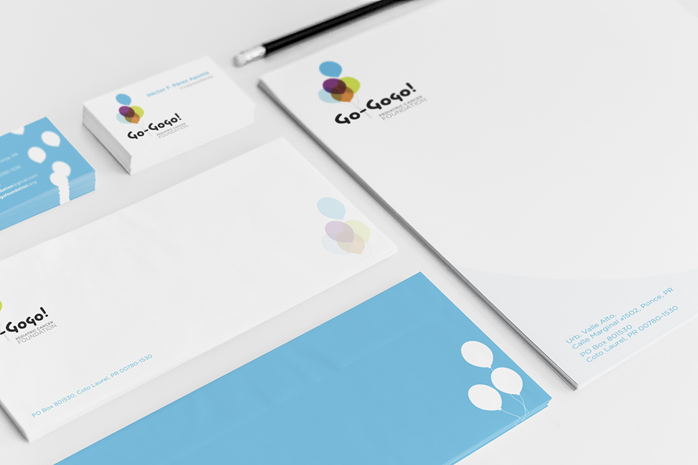
Stationery Kit
The pediatric Cancer Foundation was given a new life with this logo. Removing the classic reference of the ribbon, the balloon gives the foundation an icon that feels authentic to the demographic it serves, kids.
The blue was taken from their original logo which used Gogo’s (their symbol child) eye color as their identifying color. Whimsical use of the balloon was carried throughout the pieces.
The balloons gave life to the logo and pulled it up from one corner.

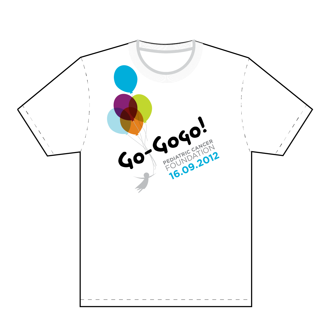
T-shirt Design
The balloons gave life to the logo and pulled it askew from one corner.

